The Role of Color Theory in Effective Design
The Role of Color Theory in Effective Design
Color is one of the most powerful tools in a designer’s arsenal. It has the ability to evoke emotions, influence perceptions, and drive actions. Understanding and applying color theory is essential for creating designs that are not only visually appealing but also effective in communicating the intended message. This article will explore the role of color theory in design, covering its basic principles, the psychological impact of colors, and how to apply color theory to create compelling designs.
Understanding the Basics of Color Theory
Color theory is the science and art of using color. It explains how humans perceive color, how colors interact with each other, and the effects different color combinations can have. The foundation of color theory lies in the color wheel, a visual representation of colors arranged according to their chromatic relationship.
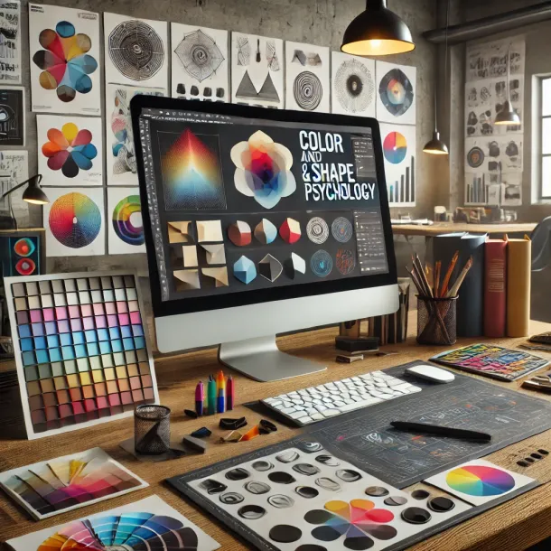
The Color Wheel
The color wheel is divided into primary, secondary, and tertiary colors:
- Primary Colors: Red, blue, and yellow are the primary colors. These colors cannot be created by mixing other colors and are the source of all other colors.
- Secondary Colors: Green, orange, and purple are created by mixing two primary colors.
- Tertiary Colors: These are created by mixing a primary color with a secondary color, resulting in colors like red-orange, yellow-green, and blue-purple.
The color wheel is an essential tool for designers, helping them understand the relationships between colors and how to combine them harmoniously.
Color Harmonies
Color harmonies are specific combinations of colors that create a pleasing effect. There are several types of color harmonies, each with its own impact on design:
- Complementary Colors: These are colors that are opposite each other on the color wheel, such as blue and orange or red and green. Complementary color schemes are high in contrast and can make a design stand out, but they must be used carefully to avoid clashing.
- Analogous Colors: These are colors that are next to each other on the color wheel, such as blue, blue-green, and green. Analogous color schemes are harmonious and pleasing to the eye, often found in nature.
- Triadic Colors: This scheme uses three colors that are evenly spaced around the color wheel, such as red, yellow, and blue. Triadic color schemes are vibrant and balanced, offering a dynamic yet harmonious look.
- Monochromatic Colors: This scheme uses different shades, tints, and tones of a single color. Monochromatic schemes are simple and cohesive, creating a subtle, elegant look.
Understanding these color harmonies allows designers to create visual interest and balance in their designs, ensuring that the colors work together to enhance the overall aesthetic.
The Psychological Impact of Colors
Colors have a profound psychological impact on viewers. They can evoke emotions, influence moods, and even affect behaviors. For designers, understanding the psychological implications of color is crucial for creating designs that resonate with the target audience.
Warm Colors
Warm colors like red, orange, and yellow are often associated with energy, warmth, and positivity. However, they can also evoke feelings of urgency and aggression if used excessively.
- Red: Red is a powerful color that signifies passion, energy, and excitement. It can also be associated with danger or warnings. Red is often used in designs to grab attention and create a sense of urgency.
- Orange: Orange combines the energy of red and the happiness of yellow. It is associated with enthusiasm, creativity, and warmth. Orange is commonly used in designs that aim to convey friendliness and approachability.
- Yellow: Yellow is the color of sunshine, associated with happiness, positivity, and optimism. However, too much yellow can lead to feelings of anxiety or frustration. It’s a great color for designs that want to evoke cheerfulness and optimism.
Cool Colors
Cool colors like blue, green, and purple are often associated with calmness, trust, and professionalism. They are ideal for designs that need to convey stability and reliability.
- Blue: Blue is a calming color that signifies trust, loyalty, and peace. It’s widely used in corporate designs, as it evokes a sense of professionalism and reliability. However, blue can also appear cold or distant if not balanced with warmer tones.
- Green: Green symbolizes nature, growth, and tranquility. It’s associated with health, wellness, and sustainability. Green is often used in designs related to the environment, finance, and well-being.
- Purple: Purple combines the calmness of blue and the energy of red, making it a color associated with luxury, creativity, and spirituality. It’s often used in designs that need to convey a sense of sophistication or mystery.
Neutral Colors
Neutral colors like black, white, gray, and brown are versatile and can balance other colors in a design. They often serve as background colors or as a base for other colors to stand out.
- Black: Black is associated with power, elegance, and sophistication. It can create a strong, dramatic contrast when paired with lighter colors.
- White: White symbolizes purity, cleanliness, and simplicity. It’s often used to create a sense of space and openness in designs.
- Gray: Gray is a neutral, balanced color that conveys professionalism and sophistication. It’s often used in corporate designs to create a formal and conservative look.
- Brown: Brown evokes a sense of warmth, reliability, and earthiness. It’s often used in designs that aim to convey stability and support.
By understanding the psychological effects of these colors, designers can choose color schemes that align with the emotional response they want to evoke from their audience.
Applying Color Theory in Design
Knowing the basics of color theory and the psychological impact of colors is only the beginning. Applying this knowledge in real-world design projects is where the true skill lies. Here are some practical ways to apply color theory in your design work:
Brand Identity
Color is a crucial component of brand identity. The colors chosen for a brand can influence how it is perceived by the public. For example, a brand that wants to convey reliability and professionalism might choose blue as its primary color, while a brand aiming to appear innovative and cutting-edge might choose a more vibrant color like red or orange.
When designing a brand’s color scheme, it’s important to consider the target audience and the message the brand wants to convey. A well-thought-out color scheme can make a brand instantly recognizable and help it stand out in a crowded marketplace.
Web Design
In web design, color plays a significant role in user experience (UX). The colors used on a website can affect how users navigate the site, how they feel while using it, and whether they take action, such as making a purchase or signing up for a newsletter.
Contrast is an important aspect of web design, ensuring that text is readable and that important elements like call-to-action buttons stand out. Designers often use complementary colors to create contrast or analogous colors for a more harmonious look. Additionally, accessibility is a crucial consideration, as colors should be chosen to ensure readability for users with visual impairments.
Marketing Materials
In marketing, color is used to capture attention and communicate messages quickly. Whether it’s a flyer, brochure, or social media post, the colors used in marketing materials can influence how the audience perceives the message and how likely they are to engage with it.
For example, using red in a limited-time offer can create a sense of urgency, prompting the audience to take immediate action. On the other hand, using blue can evoke trust, making the audience feel more comfortable with a product or service. Understanding how to use color to elicit specific responses is key to effective marketing design.
Product Design
Color is a critical element in product design, influencing both aesthetics and functionality. The colors chosen for a product can affect its appeal, usability, and even perceived value. For example, electronics are often designed in sleek, neutral colors like black or silver to convey sophistication and modernity, while children’s toys are often bright and colorful to attract attention and appeal to a younger audience.
In product design, color theory is also applied to create visual hierarchies, guide user interaction, and ensure that products are accessible to a wide range of users. Designers must consider how colors will look in different lighting conditions and how they will appear on different materials.
Common Pitfalls in Color Theory
While color theory is a powerful tool, it’s important to be aware of common pitfalls that can undermine your design work:
Overusing Complementary Colors
While complementary colors can create striking contrasts, overusing them can lead to designs that are overwhelming or visually jarring. It’s essential to balance these colors with neutrals or less intense hues to avoid a clash.
Ignoring Cultural Differences
Colors can have different meanings and associations in different cultures. For example, while white is often associated with purity in Western cultures, it is associated with mourning in some Eastern cultures. Designers working on international projects must be mindful of these cultural differences to avoid miscommunication.
Neglecting Accessibility
Designs that rely heavily on color to convey information can be challenging for individuals with color blindness or other visual impairments. Ensuring that there is sufficient contrast and using text or icons to supplement color-based information can help make designs more accessible.
The Future of Color in Design
As design trends evolve, so too does the use of color. The future of color in design will likely see the continued integration of technology, such as the use of color in augmented reality (AR) and virtual reality (VR) environments. Designers will need to stay updated on these trends and continue to adapt their understanding of color theory to new mediums and technologies.
Moreover, with the growing emphasis on sustainability, there may be a shift toward more natural, earthy color palettes that reflect environmental consciousness. Designers will need to balance the desire for modern, cutting-edge aesthetics with the demand for sustainability and ethical design practices.
Conclusion
Color theory is fundamental to effective design. By understanding the relationships between colors, their psychological impacts, and how to apply them in various contexts, designers can create work that is not only visually appealing but also emotionally resonant and impactful.
As a designer, mastering color theory enables you to communicate more effectively with your audience, create cohesive and compelling brand identities, and enhance the overall user experience. Whether you’re designing for print, web, or product, the thoughtful application of color theory is what elevates your work from good to great.
Relacionados