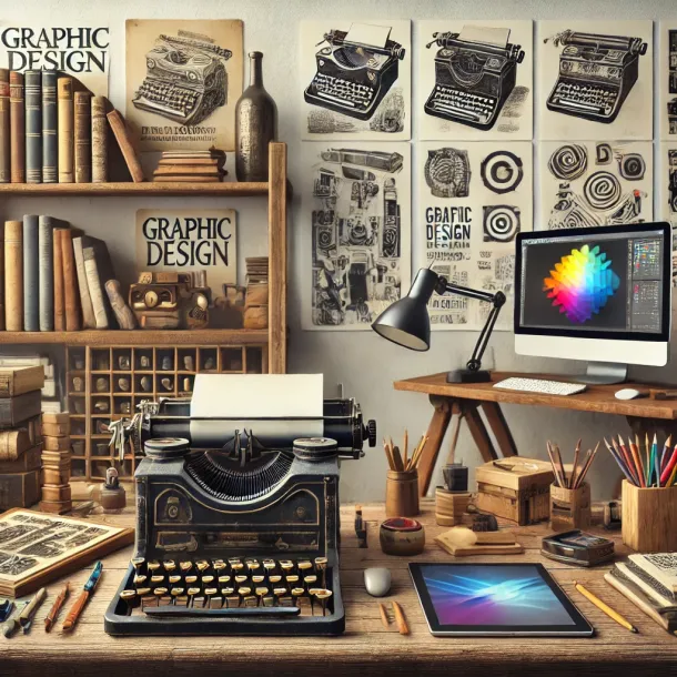
Essential tools for beginners in digital design (without losing your mind)
Essential tools for beginners in digital design (without losing your mind)
Starting in digital design can feel like you need every tool, every plugin, and every new AI feature just to be “ready.” The result is usually the same: you install a bunch of stuff, watch ten tutorials, and still feel stuck when it’s time to actually design.
This guide is here to do the opposite. It’ll give you a clean, beginner-friendly tool stack that covers what you’ll use in real work—without overwhelming you. Think of it as a “starter kit” that keeps you focused on building skills and delivering good work.
The beginner rule: fewer tools, deeper skill
Before we talk tools, lock this in: you don’t become employable by collecting software. You become employable by being able to:
- create clear layouts fast
- keep consistency across screens/assets
- organize files properly
- deliver in the right formats
- iterate based on feedback
Tools should support that. So we’ll focus on the smallest set that covers most beginner jobs.
Category 1: Your main design tool (pick one and commit)
You need one “home base” tool—the place where most of your design happens.
Figma (best all-around choice for digital)
If your goal is to work in digital teams, UI, web, product, or marketing design, Figma is the safest bet.
Use it for:
- social assets and templates
- landing pages and web layouts
- UI screens (apps/sites)
- component libraries and basic design systems
- collaboration and handing off to devs
Beginner features to learn first:
- Frames + sizing (social, mobile, desktop)
- Text styles + color styles
- Components (buttons, cards)
- Auto Layout (basic)
- Exporting (PNG/JPG/SVG)
Why beginners like it: it’s clean, fast, collaborative, and you won’t fight the interface.
Canva (good for social/content roles—and speed)
Canva is great if you’re doing:
- social media design
- quick marketing assets
- content-heavy templates
- small business visuals
But be careful: in many professional teams, Canva is a complement—not the main production tool. If you want to grow into UI/web/product, prioritize Figma.
Adobe (useful, but don’t start with “the whole suite”)
Adobe is powerful, but beginners often get lost because there are too many apps. If you go this route, keep it simple:
- Photoshop: photo editing, compositing, banners
- Illustrator: vector logos, icons, brand assets
If you’re a complete beginner, you can start in Figma and only add Adobe later when you need it.
Category 2: Image sourcing and management (so your work looks stronger)
Design quality often improves instantly when your images are better.
Stock images (choose reliable sources)
You’ll need a consistent way to get photos and visuals. Use stock when you don’t have brand photography.
What to look for:
- consistent style (lighting, mood, color)
- high resolution
- realistic scenes (avoid overly “fake” corporate vibes)
Icon libraries (for clean UI and marketing)
Icons save time and keep consistency.
Beginner icon rules:
- don’t mix different icon styles in one design
- keep stroke weight consistent
- prefer simple, readable shapes
Use icons for:
- feature lists
- benefit sections
- UI elements
- “quick scan” content blocks
Category 3: Color and typography helpers (for faster, better decisions)
Color palette tools
The goal isn’t to become a color theorist—it’s to choose consistent palettes that don’t break readability.
Use these tools for:
- generating a base palette
- checking contrast
- creating light/dark variations
Beginner checklist for color:
- 1 primary color
- 1 neutral scale (gray range)
- 1 accent color (optional)
- contrast strong enough for text
Typography tools
Typography is where beginner work often looks “off.” Not because the font is wrong, but because sizing and spacing are inconsistent.
Typography basics to lock in:
- 2–3 font sizes (headline, subhead, body)
- consistent line-height
- avoid overly decorative fonts early
- don’t use five weights in one layout
Category 4: Writing and copy support (because text is half the design)
In digital design, your layout is only as strong as the message. You don’t need to be a copywriter, but you need tools to keep text clear.
What you need:
- a simple place to draft headlines and variations
- a way to check spelling/grammar
- a habit of writing short and specific
Beginner copy rules:
- one clear message per piece
- remove filler words
- make the CTA obvious
Category 5: File organization and delivery (the “pro” skill nobody teaches)
This is where you can look professional fast.
Cloud storage and folder structure
No matter what tools you use, you need a clean system for:
- saving source files
- exporting final assets
- tracking versions
Beginner folder structure example:
- 01_Brief
- 02_Working
- 03_Exports
- 04_Final
- 05_Archive
Versioning rule:
- use v1, v2, v3 (not “final_final_reallyfinal”)
- keep old versions unless told otherwise
Export settings (so your work looks sharp everywhere)
Most beginner exports look blurry because of wrong sizing or compression.
Quick export guidelines:
- social posts: PNG for crisp text
- photos: JPG when file size matters
- icons/logos: SVG
- presentations: export PDF when sharing externally
Always check:
- resolution
- readability on mobile
- file size limits (especially for ads)
Category 6: Feedback and collaboration (how real teams work)
Design is rarely “one and done.” You’ll revise. Tools that make feedback smoother matter.
What to practice:
- sharing a link (not sending 12 files)
- capturing feedback in one place
- responding with options (A/B) instead of arguing
A beginner-friendly habit:
- when you get feedback, create 2 variations
- explain what changed in one sentence per variation
Category 7: Time-savers that won’t overwhelm you
Use time-savers only after your base workflow is stable.
Good “safe” time-savers:
- reusable templates (social layouts, ad layouts)
- simple component libraries (buttons, cards, badges)
- a small set of text styles and spacing rules
- a checklist before exporting
Avoid early on:
- downloading dozens of plugins
- trying new tools every week
- relying on AI to “design for you” before you understand layout
The “starter stack” (simple, practical, enough for real work)
If you want a clean setup with minimal chaos:
- Main design tool: Figma
- Quick content tool (optional): Canva
- Basic image editing (optional): Photoshop or a lightweight editor
- Assets: stock photos + one icon library
- Typography + color support: palette generator + contrast checker
- Organization: cloud folders + version naming
- Delivery: export rules + a pre-send checklist
That’s enough to do social, ads, landing pages, simple UI, and a strong beginner portfolio.
Common beginner mistakes with tools (and how to avoid them)
- Learning tools instead of learning design
Tools change. Fundamentals don’t. Spend more time on hierarchy, spacing, typography, and clarity. - Switching tools too often
Pick one main tool and commit for 30 days. - Using too many fonts, colors, and effects
Most professional designs are simple and consistent. - Poor file organization
If your files are a mess, collaboration becomes painful. Build good habits early. - Exporting without checking mobile
Always preview on a phone screen size—most people will see your work there.
Conclusion
You don’t need a massive toolbox to start in digital design. You need a reliable, simple setup that helps you practice the fundamentals, produce consistent layouts, and deliver correctly.
Choose one main design tool, build a small asset system around it, and focus on repetition: templates, spacing rules, typography consistency, clean exports. That’s what will make you faster, more confident, and easier to hire—without burning out.
Relacionados